10 Charts to Understand Climate Crisis
10 Charts to understand the climate crisis, why it’s impossible to be carbon neutral by 2050, but still remain optimistic about the future.
Over the past few years I’ve probably read ~10 books on climate and energy (these being my favorite), plenty of blogposts about it and a fair share of Twitter threads.
I’ve come away with a cautiously optimistic view on climate. The energy transition away from fossil fuels seems to be well underway (that’s the optimistic part), but like all past energy transitions, this too will likely take many decades. That’s the pessimistic pragmatic part. A high degree of certainty that we won’t be carbon neutral by 2050.
This short post is my best attempt (from an outsider, not as a climate expert) to create an accessible narrative - 10 charts - that broadly explains what’s going on with the climate based on what I’ve read and learned.
All the charts and underlaying datasets are available here.
1/ Global temperature is rising fast, and reaching record levels (vs pre-industrial times)
2/ Annual greenhouse gas emissions are still growing
3/ Despite all the effort, +60% of Electricity is still from dirty sources
4/ And in fact, coal is growing faster that renewables (nominally)
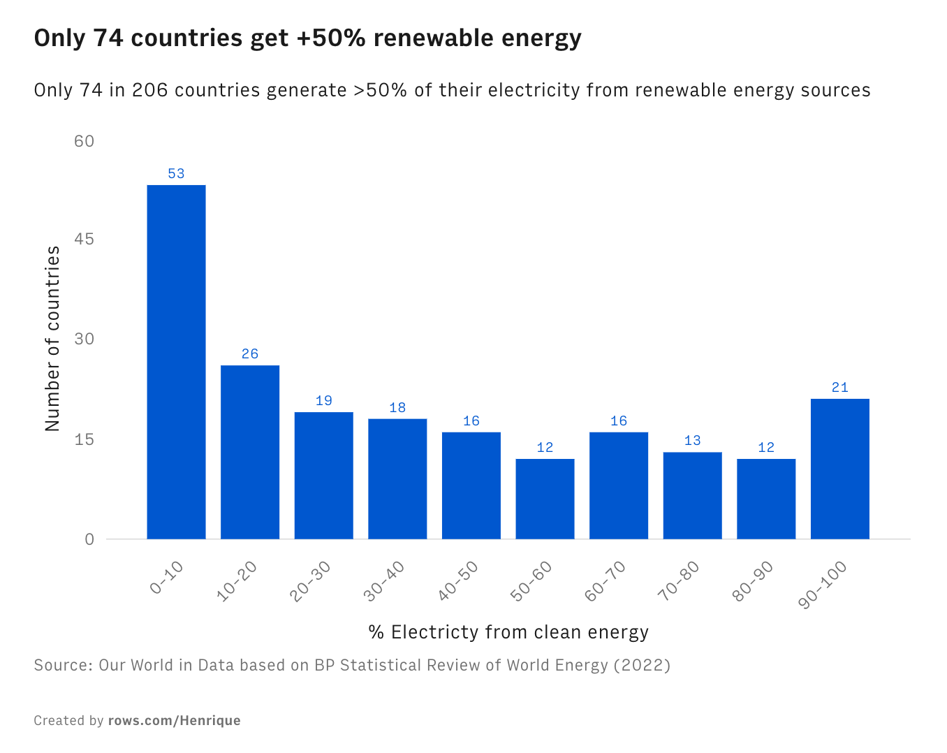
5/ Only 74 countries get +50% electricity from renewable sources
6/ Large countries are not leaders in renewable energy
7/ That’s a problem because future population growth will come from those countries, mostly in Africa and Asia
8/ The great news is that the price of solar panels and batteries dropped +90%
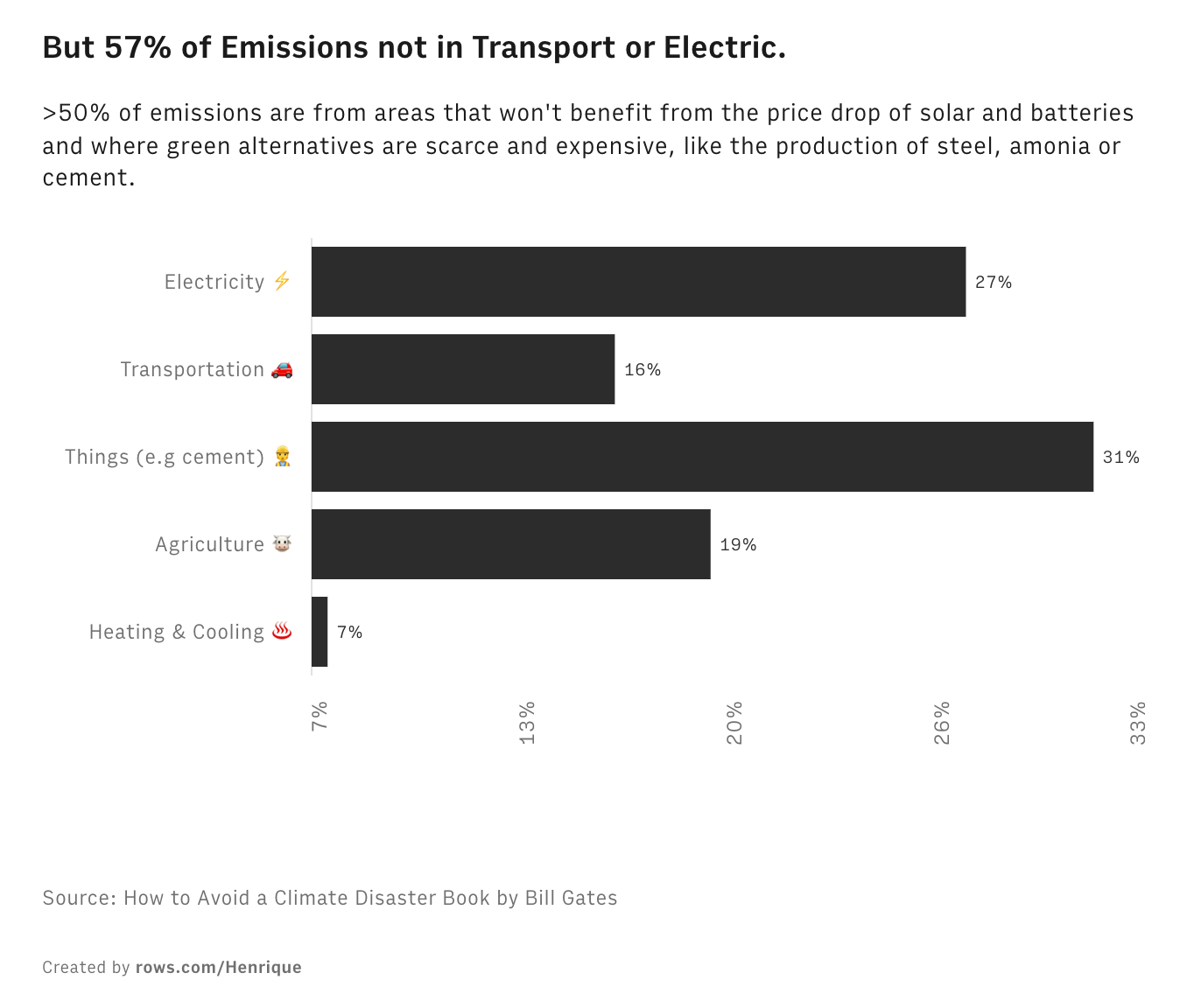
9/ But that’s not enough, as 57% of Emissions not in Transport or Electricity
10/ Fortunately, economic growth and emissions are decoupled so there’s a path for economic growth with a green economy transition
That’s it. Thank you for reading!


